
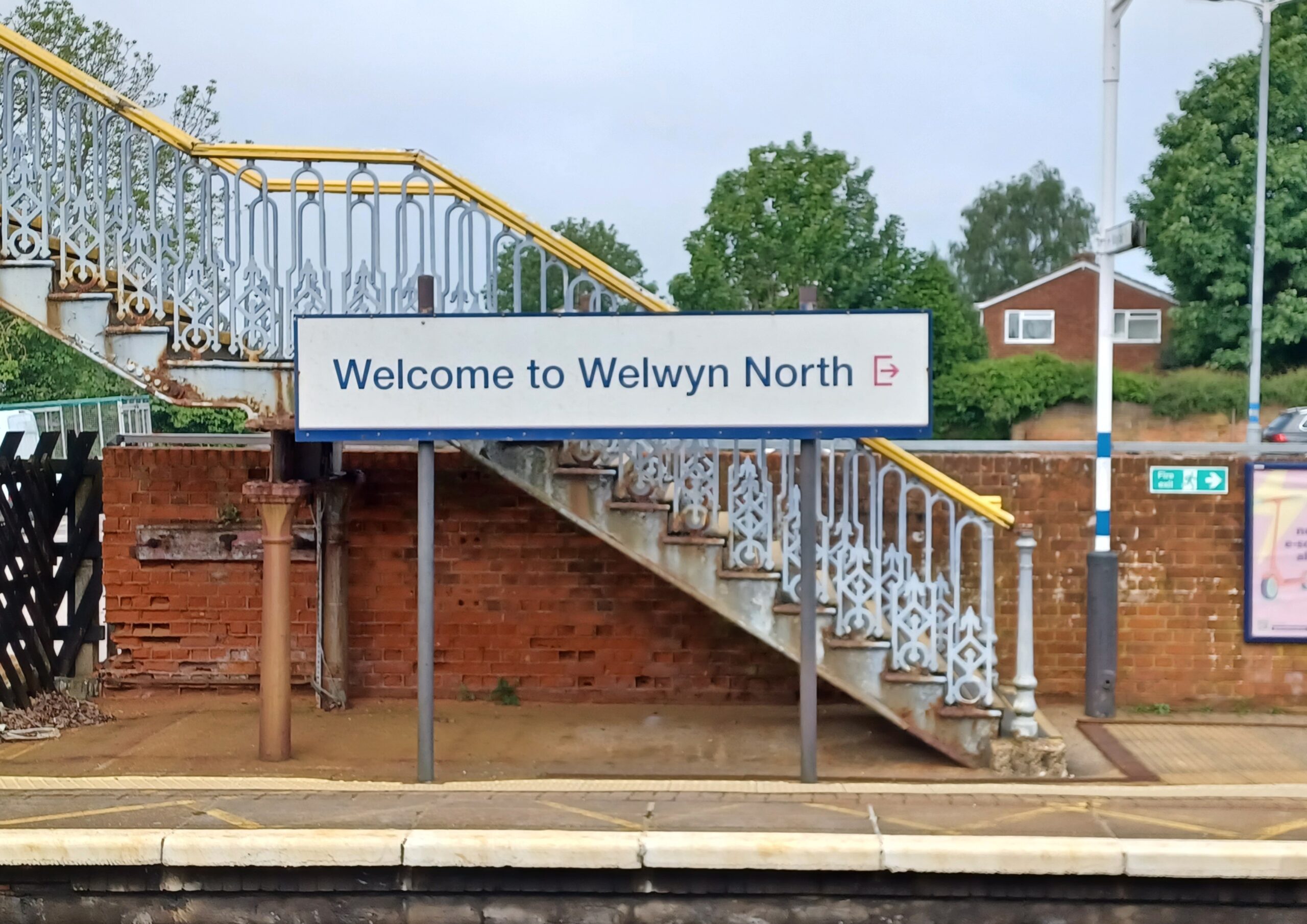
When I need to visit London, I go by train from Welwyn North. It’s a very good service, with only a handful of stops before reaching King’s Cross in about 25 minutes, and while I’m settling myself into my surprisingly comfortable seat (ergonomists and osteopaths may well have been consulted) the automated announcer ‘welcomes’ me ‘aboard’. This never fails to amuse me. For a second I reflect that it’s not the Golden Arrow or the Orient Express, which might better merit such corporate grandiloquence, but the 08.35 semi-fast from Peterborough, calling at St Neot’s, Biggleswade, Hitchin and so on.
Whoever oversaw the final version of the audio made a good choice with the vintage RP female voice, calm, reassuring and authoritative, but failed to ensure that the recorded segments were closely enough joined together. The announcement is blemished by what phonologists call a micropause, that is, a pause of less than a second’s duration, and indicated in transcripts by the following symbol (.) For once not feeling punctilious about punctuation, that’s going to serve there as my full stop. Anyway, now you know what a micropause is, I can tell you that the announcement goes as follows:
Welcome aboard this (.) service (.) to London King’s Cross.
It’s not the second one that matters here, but the first. Do you hear it as I do? In that little pause I imagine the speaker struggling to find just the right word to describe the experience without actually calling it a total shambles, which from time to time I expect it is. ‘Service’ is a perfectly acceptable and accurate word, but in that briefest of pauses, you imagine all the possible alternatives being juggled with, much as the wheels of a fruit machine revolve before settling on their final choice. And so we have comic irony, all captured in an unintended micropause. In that space is generated the magic spark, which shows yet again that in comedy, timing is everything.
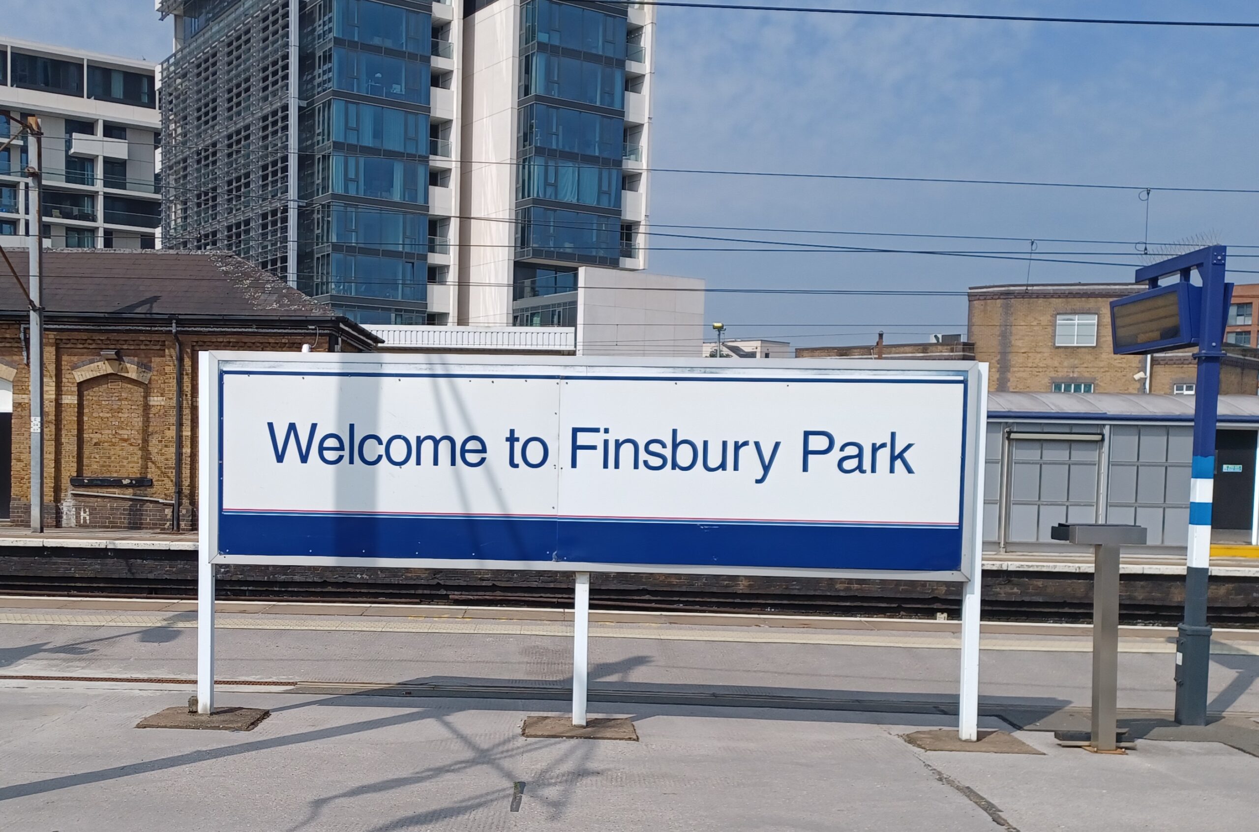
But anyway, we’re now at Finsbury Park, the penultimate stop on my journey. I’m at risk of sounding a bit Lord Snooty here, but I’ll take that for the purpose of the argument. For those unfamiliar with north London, Finsbury Park is one of its less salubrious areas. Yes, it has the eponymous park and yes, it had the Sir George Robey pub until this was sadly demolished a generation ago. But, as my GCSE students often used to say at the end of their speaking and listening assessments, that’s about it really. Crouch End it ain’t, nor Highgate. It’s a place to pass through rather than linger in.
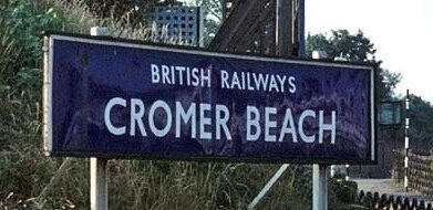
Back to the language. There’s been a trend for quite a while now that public signage should have a friendly and approachable tone. In the olden days of nationalisation’s early years, the whole British Railways network was branded (not a word that would have been used then) with a uniform style. Its signs were made of vitreous enamel over a wooden frame, and were pretty well weatherproof until chipped by a flying stone. With upper-case white characters in the superlative Gill Sans font, against a background of one of six different colours according to region (Eastern Region was dark blue, Southern green and so on) the design standard has never been equalled since; well-proportioned, uncomplicated, and easy to read. A main station sign would be headed ‘British Railways’ then underneath, in larger characters, would be the station name, clearly fulfilling the sign’s public information function.
But these excellent signs were discarded in the mid-1960s modernisation programme which accompanied the demise of steam traction, and also gave us the now well-known double arrow logo on its red ground, along with the blue and white coach livery. Gone was the clear Gill Sans in favour of something smaller and meaner, black lower-case characters on a white background. Why is it that so many ‘improvements’ are actually steps backwards? Later, in the 1980s, marketing executives decided that simple and straightforward messaging was no longer sufficient – the language had to change. Railway ‘passengers’ became ‘customers’, as now, to our collective cultural loss, everything was being commoditised. Signage would now address the customer with a faux warmth, and henceforth we would be ‘welcomed’ to Finsbury Park and, it seems, all manner of other places.
The problem with this shift of focus is that in sociolinguistic terms there is now an implied speaker, setting up a different relationship with the reader. Of course most people will hardly notice this, and only eccentrics like me, and you too I hope, sit up and take note. These changes happen uncanvassed and unchallenged, imposed by unaccountable and impersonal forces, but irrevocably change our shared environment.
We must now all be ‘welcomed’ then, as if the notional speaker were waiting to take our coats and offer us a flute of bubbly. This voice though is so easily subverted by contextual detail and made vulnerable to comedic or ironic subversion. The quality of the service, the character and identity of the place and so on, may all serve to undermine the upbeat message. I’ve even seen ‘Welcome to Forest Hill station car park’, which really is taking the you-know-what. It’s the paradox, the antithesis and unplanned irony. You’ll see it at Welwyn North too, so it must be a system-wide standard. With tone-deaf dedication like this it seems then that for the foreseeable future, we must resign ourselves to being abstractly welcomed not only to Finsbury Park, but everywhere else as well. Bon voyage, as we say in English.